In this article, we look at the additional features of HTML text markup and custom CSS so that quality-formatted content makes it easier to explore your knowledge base.
Articles are added via the following path: administrator account → "Help Center" section → "Articles" subsection. It is also possible to add a new article from the agent's account through the "Knowledge Base" section, if the agent has the corresponding permission in the additional access rights.
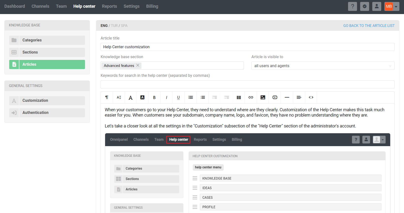
Basic formatting options are available in the top panel of the WYSIWYG editor:

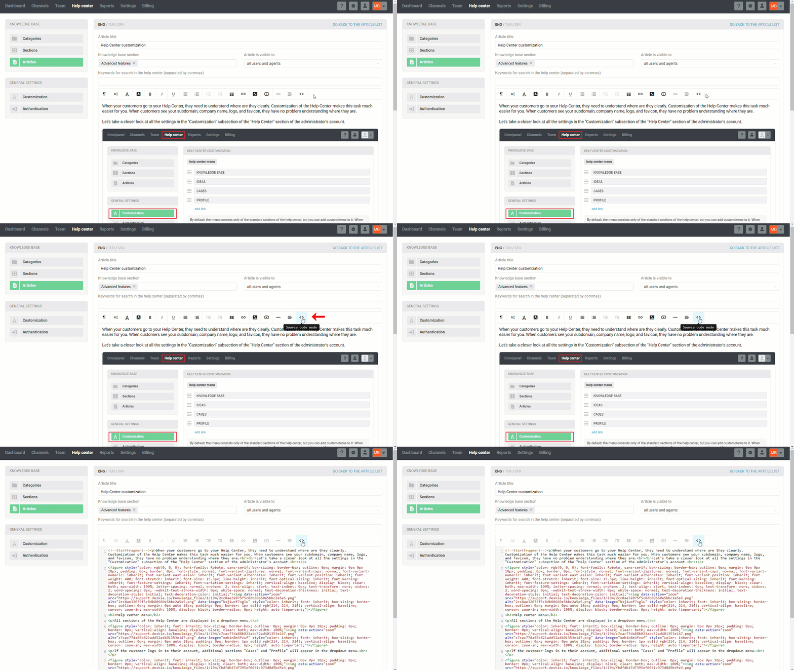
If the visual editor is not enough for your article design, you will need to make changes via HTML markup. To switch to the source code editing mode, click on the < > icon in the toolbar.

We have prepared examples of block design that may come in handy in your work.
1. Preformatted text
Code samples, auto-responses, and other text that the user needs to copy in its original form should be written through the opening and closing pre tags:
<рre>[code]</рre>
Example of API request code to create a case:
{
    "case" : {
        "user_email" : "[email protected]",
        "user_full_name" : "John",
        "subject" : "I need help",
        "content" : "Can I change the domain?",
        "labels" : [101, 102]
    }
}
Further in the article we will display all the code samples in this way.
2. Spoilers
A spoiler is an expandable block where you can hide additional information so as not to overload the article. It is added using details and summary tags:
<details>
    <summary>Spoiler header</summary>
    <p>Hidden part (text, image, etc.)</p>
</details>
Display example:
Help center customization
The Help center customization article is available in your Help center knowledge base, which you get after registration. To read previously added articles or add a new one, go to your administrator account — Help center section — Articles subsection

PRO hints:
To ensure that the spoiler is always minimized when opening an article, use an additional property of the opening tag: <details closed=""> or save the article with the spoiler minimized.
Use standard HTML tags in the source code mode to design the hidden part, or after adding the spoiler tags, switch to the visual editor and edit the text to your liking there.
3. Quotation
To make the quote stand out from the background of the main text, use HTML markup like this:
<div class="omni_quote">
    <blockquote>[Quote]</blockquote>
    <figcaption>[Author], <cite>[source, author's description, title, etc.]</cite></figcaption>
</div>
Example of a quote:
The language needed to be completed by the release of the Netscape Navigator 2 browser. We wanted scripts to be embedded in HTML code, although this was objected to by some people. As a result, JavaScript was developed in a big rush — in fact, we made it in just 10 days.
If you don't need a caption for the quote, which includes its author and source, simply omit the figcaption tag.
<div class="omni_quote">
    <blockquote>[Quote]</blockquote>
</div>
In this variant, the quote looks simpler:
The language needed to be completed by the release of the Netscape Navigator 2 browser. We wanted scripts to be embedded in HTML code, although this was objected to by some people. As a result, JavaScript was developed in a big rush — in fact, we made it in just 10 days.
PRO hint:
You can change the appearance of the quote either through custom CSS for the help center or through inline styles in the article's source code. In the latter case, for example, to change the border color to green, you would need to add the style as follows for the opening blockquote and figcaption tags: <[tag] style="border-color: green !important;">. As a result, the quote will look like this:
In my dissertation, there is a whole section dedicated to the shortcomings of CSS. Yes, they exist, including some that are our fault. However, the biggest problem with the first version was not the design of the language itself (in my opinion, it's quite good), but its implementation in browsers.
!important prioritizes the style over global styles;
in the example above, the link to the source is formatted as follows:
<cite>Creator of CSS. <a href="https://dev.opera.com/articles/css-twenty-years-hakon/">Source</a></cite>
4. Information blocks
Information blocks enable readers to concentrate on crucial points by distinguishing them from the surrounding text. There are three ways to display information blocks in the knowledge base:
a. Ready-to-use information blocks
Two block options are available for selection:
i) Titled ready-to-use information blocks
Your help center already contains styles for ready-to-use information blocks, so all you need to do is use the following HTML structure:
<div class="omni_[tag]">
    <[tag]_title>[Cutom block title]<[/tag]_title>
    [Text of the information block, which is formatted with  standard HTML tags]
</div>
Copy the HTML markup of the appropriate block, go to the source code of the article and paste the copied HTML.
Block "Information"
CSS (Cascading Style Sheets) — is the code you use to style your web page.
HTML markup of the "Information" block
<div class="omni_info">
    <info_title>Information</info_title>
    <p>CSS (Cascading Style Sheets) — is the code you use to style your web page.</p>
</div>
Block "Note"
You can pick up custom CSS through your browser: hover over the element whose style you want to change → right-click → select the "View code" option → change the parameters and style values. There is an example here.
HTML markup of the "Note" block
<div class="omni_note">
    <note_title>Note</note_title>
    <p>You can pick up custom CSS through your browser: hover over the element whose style you want to change → right-click → select the "View code" option → change the parameters and style values. There is an example <a href="https://support.deskie.io/knowledge_base/item/193" target="_blank">here</a>.</p>
</div>
Block "Warning"
When the page is refreshed, any changes made via "View Code" are discarded.
HTML markup of the "Warning" block
<div class="omni_warning">
    <warning_title>Warning</warning_title>
    <p>When the page is refreshed, any changes made via "View code" are discarded.</p>
</div>
Block "Confirmation"
After inserting the HTML markup of the block you want, all you need to do is change the text from the example to yours and save your changes.
HTML markup ot the "Confirmation" block
<div class="omni_confirmation">
    <confirmation_title>Confirmation</confirmation_title>
    <p>After inserting thr HTML markup of the block you want, all you need to do is change the text from the example to yours and save your changes.</p>
</div>
Block "Technical details"
Within the information blocks, you can use any tags to further format the text: bold, italic, etc.
HTML markup of the "Technical details" block
<div class="omni_details">
    <details_title>Technical details</details_title>
    <p>Within theinformation blocks, you can use any tags to further format the text: <strong>bold</strong>, <em>italic</em>, etc.</p>
</div>
ii) Untitiled ready-to-use information blocks
Light version, displaying only an icon and text. To obtain the simplified version, simply remove the second line with the <tag_title> from the HTML markup of the block.
<div class="omni_[tag]">
    [Text of the information block, which is formatted with standard HTML tags]
</div>
Untitiled "Information" block
CSS (Cascading Style Sheets) — is the code you use to style your web page.
HTML markup of the "Information" block
<div class="omni_info">
    <p>CSS (Cascading Style Sheets) — is the code you use to style your web page.</p>
</div>
Untitiled "Note" block
You can pick up custom CSS through your browser: hover over the element whose style you want to change → right-click → select the "View code" option → change the parameters and style values. There is an example here.
HTML markup of the "Note" block
<div class="omni_note">
    <p>You can pick up custom CSS through your browser: hover over the element whose style you want to change → right-click → select the "View code" option → change the parameters and style values. There is an example <a href="https://support.deskie.io/knowledge_base/item/193" target="_blank">here</a>.</p>
</div>
Untitiled "Warning" block
When the page is refreshed, any changes made via "View Code" are discarded.
HTML markup of the "Warning" block
<div class="omni_warning">
    <p>When the page is refreshed, any changes made via "View code" are discorded.</p>
</div>
Untitled "Confirmation" block
After inserting the HTML markup of the block you want, all you need to do is change the text from the example to yours and save your changes.
HTML markup ot the "Confirmation" block
<div class="omni_confirmation">
    <p>After inserting the HTML markup of the block you want, all you need to do it change the text from the example to yours and save changes.</p>
</div>
Untitiled "Technical details" block
Within the information blocks, you can use any tags to further format the text: bold, italic, etc.
HTML markup of the "Technical details" block
<div class="omni_details">
    <p>Within the information blocks, you can use any tags to further format the text: <strong>bold</strong>, <em>italic</em>, etc.</p>
</div>
b. Custom information blocks via custom CSS
Ready-to-use information blocks, of course, will not cover 100% of usecases. Therefore, if necessary, you can either create completely custom blocks or slightly modify the styles of ready-to-use ones.
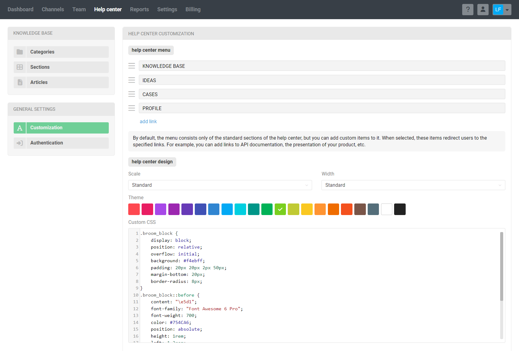
You can add custom CSS for the help center by following the path: admin account → "Help Center" section → "Customization" subsection → "Custom CSS" field.

For example, let's create a custom block asking you to clear your browser cache:
The keyboard shortcut Ctrl+F5 will refresh the page ignoring cache, and Ctrl+Shift+Del will open clearing the browser cache.
Custom CSS of the block
.broom_block {
    display: block;
    position: relative;
    overflow: initial;
    background: #f4ebff;
    padding: 20px 20px 2px 50px;
    margin-bottom: 20px;
    border-radius: 8px;
}
.broom_block::before {
    content: "\e5d1";
    font-family: "Font Awesome 6 Pro";
    font-weight: 700;
    color: #754CA6;
    position: absolute;
    height: 1rem;
    left: 1.3rem;
}
.broom_block broom_title {
    margin-bottom: 15px;
    font-weight: 700;
    color: #754CA6;
    position: relative;
    display: block;
}
As you can see from the structure, we have created the .broom_block class, which includes two objects: ::before (for the icon) and broom_title (for the title). These are the tags that should be used in HTML markup. If you do not specify the main <div class="broom_block"> class, the styles will not work.
HTML block markup
<div class="broom_block">
    <broom_title>Clear cache!</broom_title>
    <p>The keyboard shortcut <strong>Ctrl+F5</strong> will refresh the page ignoring cache, and <strong>Ctrl+Shift+Del</strong> will open clearing the browser cache.</p>
</div>
Additional nuances:
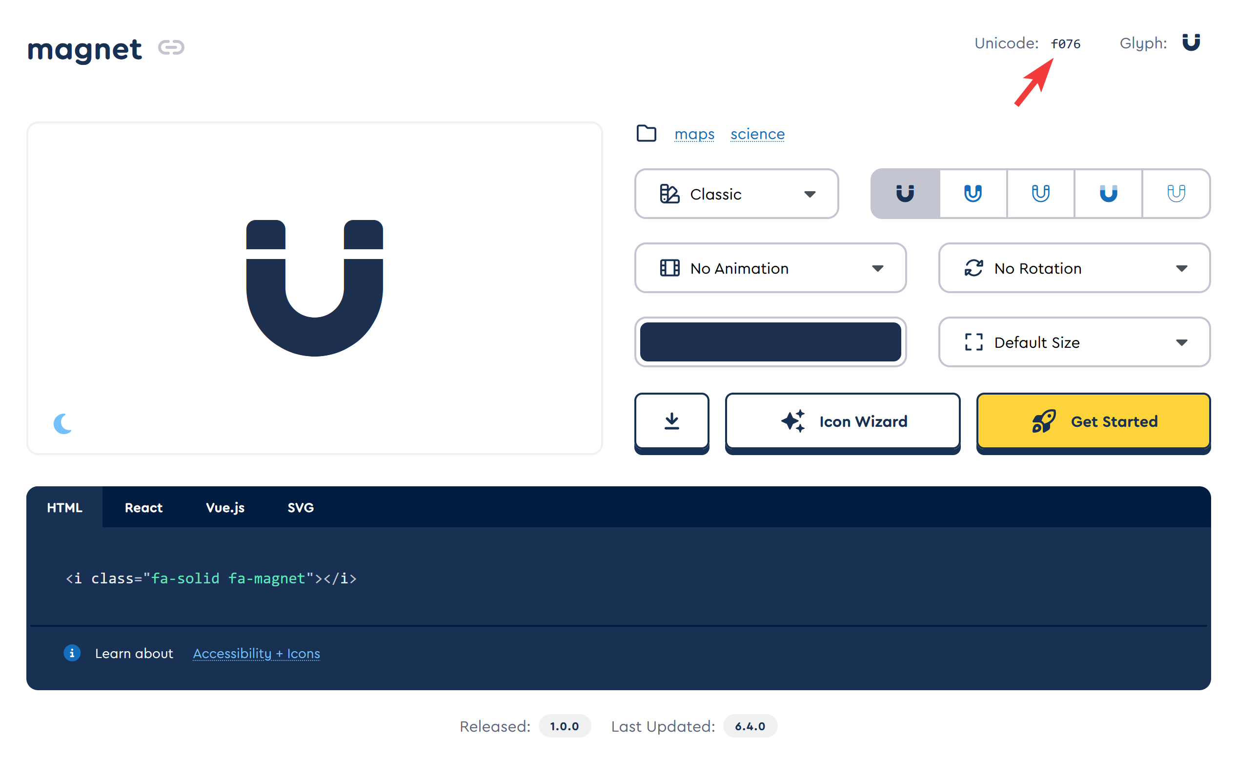
The icons of Font Awesome 6 Pro font are used in the help center. You can use any icon, except for brand logos: select an icon → click on unicode to copy (see screenshot) → paste it into the ::before object style in the content parameter to get content: "\[unicode_icons]";.
Custom styles are used only for the help center. They are not displayed in the administrator and agent accounts.
Taking into account that formatting will not appear in the HTML editor in the same way as in the knowledge base, to test custom blocks we recommend creating an article with limited access at first, and after getting the desired appearance make it available not only for agents, but also for customers.

c. Custom information blocks via styles in HTML markup
This option allows you to specify the necessary styles directly in the source code of the article. It makes sense to use it for one-time changes if you do not plan to create styles for a block that you will insert into different articles.
In this case, styles can be added to most tags via the style attribute in the format <[tag] style="[style parameters]">.
An example of adding the style attribute to the div and p tags:
<div style="display: flex; flex-direction: column; position: static; background: #e5fadb; padding: 15px 10px 0px 20px; margin-bottom: 20px !important; overflow: initial; border-left: 3px solid darkgreen;">
    <p style="margin-bottom: 15px !important; color: #006400;"><strong>Styling a custom block via the source code of the article.</strong></p>
    <p>The custom block is specified in the HTML markup of the article itself. This option is suitable if you need to use the custom block only in this article.</p>
</div>
As a result, we get:
Styling a custom block via the source code of the article.
The custom block is specified in the HTML markup of the article itself. This option is suitable if you need to use the custom block only in this article.
Note that properties specified in HTML markup using the style attribute usually override global CSS properties. In some cases, you should specify !important if you want styles in the HTML markup to take priority. For example, background: #e5fadb !important;
Styling with inline CSS is available for most tags; however, it is recommended, when possible, to specify styles in custom CSS for better maintainability, as there may be browser compatibility issues, and the HTML document itself will become significantly larger.
5. Other useful blocks
HTML and CSS have a lot of possibilities, and it's impossible to understand all of them. But we'll tell you about a few more ways to design your articles :)
a. Block styled with separators
The hr tag adds a horizontal line that can separate text into a separate block:
Need help? Feel free to reach out to us or consult the knowledge base.
If you're just starting to learn Deskie, we recommend checking out the brief video tutorials.
HTML block markup with separators
<hr>
    <p style="text-align: center;"><strong>Need help?</strong> Feel free to reach out to us or consult the <a href="https://support.deskie.io/knowledge_base/">knowledge base</a>.</p>
    <p style="text-align: center;">If you're just starting to learn Deskie, we recommend checking out the brief <a href="https://deskie.io/features/">video tutorials</a>.</p>
<hr>
b. Blocks with links and buttons
The content of a lengthy article, links to useful articles or links to third-party resources can also be formatted in separate blocks.
i) Vertical menu
Format links to articles of similar topics or the content of a larger article in a separate block, as we did at the beginning of these instructions.
This block requires the addition of a large number of styles, so it's not possible to include them in the HTML document (inline styles). They need to be added through custom CSS for the help center.
Custom CSS of "Related Articles" block
.relart {
    margin-bottom: 20px;
}
.relart r_title {
    display: block;
    position: relative;
    font-family: Roboto, Helvetica, Arial, sans-serif;
    font-weight: 600;
    margin-bottom: 15px;
    font-size: 18px;
}
.relart r_links {
    position: relative;
    border: 1px solid #eee !important;
    border-radius: 5px;
    padding: 0px;
    position: relative;
    display: flex;
    flex-direction: column;
}
.relart a {
    outline: none;
    text-decoration: none;
    flex: 1;
    font-family: Roboto, Helvetica, Arial, sans-serif;
    color: #595959 !important;
    line-height: 2.5;
    padding-left: 15px;
    padding-right: 15px;
    border-radius: 5px;
    color: #05a !important;
    background-color: #ffffff !important;
}
.relart a::after {
    content: "\f054";
    font-family: "Font Awesome 6 Pro";
    font-weight: 300;
    color: #05a;
    position: absolute;
    height: 1rem;
    right: 1rem;
}
.relart a:link {
    background-color: #fbfbfb;
}
.relart a:visited {
    background-color: #fbfbfb;
}
.relart a:focus {
    text-decoration: none;
    background: #e5edff;
    color: #1261ff !important;
}
.relart a:hover {
    text-decoration: none;
    background: #f8f8f8 !important;
    border-radius: 0px;
    color: #05a !important;
    opacity: 1.0 !important;
}
.relart a:first-child:hover {
    border-radius: 4px 4px 0 0;
}
.relart a:last-child:hover {
    border-radius: 0 0 4px 4px;
}
.relart a:active {
    background: #e5edff;
    color: #05a !important;
    opacity: .7 !important;
}
HTML markup of the "Related Articles" block
<div class="relart">
    <r_title>Related articles</r_title>
    <r_links>
            <a href="https://support.deskie.io/knowledge_base/item/988">A brief guide to the Help center</a>
            <a href="https://support.deskie.io/knowledge_base/item/200">How to create a knowledge base</a>
            <a href="https://support.deskie.io/knowledge_base/item/914">How does customer's personal account look like</a>
            <a href="https://support.deskie.io/knowledge_base/item/194">Help center customization</a>
    </r_links>
</div>
ii) Link with bottom border
You can explicitly highlight a link by adding a bottom underline and an icon:
Custom CSS of the "Find out more" link
.superlink super_button {
    font-size: 18px;
    display: inline-block;
    background: inherit;
    padding: 0px;
    border-bottom: 3px solid #377FEA;
    padding: 0px 0px 3px;
    margin-bottom: 20px;
}
.superlink a {
    outline: none;
    text-decoration: none;
    font-family: Roboto, Helvetica, Arial, sans-serif;
    font-weight: 700;
    color: black !important;
}
.superlink a::after {
    content: "\e09f";
    font-family: "Font Awesome 6 Pro";
    font-weight: 700;
    color: black;
    width: 13.5px;
    display: inline-block;
    margin-left: 6px;
}
.superlink a:link {
    background: inherit;
}
.superlink a:visited {
    background: inherit;
    color: #black;
}
.superlink a:focus {
    text-decoration: none;
    background: inherit;
    color: #3882f0 !important;
}
.superlink a:hover {
    text-decoration: none;
    background: inherit;
    color: #3882f0 !important;
    opacity: .8 !important;
}
.superlink a:hover::after {
    text-decoration: none;
    background: inherit;
    color: #3882f0 !important;
    opacity: .8 !important;
    transition: all .35s ease-out !important;
}
.superlink a:active {
    background: inherit;
    color: #3882f0 !important;
}
HTML markup of the "Find out more" link
<div class="superlink">
    <super_button><a href="https://support.deskie.io/knowledge_base/item/194">Find out more</a></super_button>
</div>
iii) Horizontal menu with buttons
If a list of important links doesn't attract enough attention from users, try formatting them as buttons:
Custom CSS of horizontal menu with buttons
.linelinks {
    display: grid;
    gap: 15px;
    align-items: center;
    margin: 20px 0;
    grid-template-columns: repeat(3,1fr);
    grid-template-rows: 1fr;
    align-items: center;
    box-sizing: border-box;
}
.linelinks a {
    color: #fff !important;
    font-weight: 600 !important;
    font-size: 17px;
    background-color: #377de9;
    border: 0;
    border-radius: 6px;
    text-align: center;
    box-shadow: 1px 2px 5px rgba(0,0,0,.2), 0px 1px 1px rgba(0,0,0,.3);
    padding: 15px;
}
HTML markup of horizontal menu with buttons
<div class="linelinks">
    <a href="https://deskie.io/features/" target="_blank">Video tutorials</a>
    <a href="https://support.deskie.io/knowledge_base/22" target="_blank">Popular use cases</a>
    <a href="https://deskie.io/pricing/" target="_blank">Turnkey setup</a>
</div>
c. Custom code block
If the standard option with the pre tag, which is responsible for displaying preformatted text, is not suitable, use the alternative code tag.
Styles can be customized to get, for example, this code display:
.code_block {
    padding: 0px;
    display: block;
    position: relative;
}
.code_block code {
    color: #000666;
    font-family: Consolas, Menlo, Monaco, monospace;
    line-height: 1.5rem;
    min-width: 100%;
    word-break: normal;
    border: 1px solid #d9d9d9;
    border-radius: 3px;
    padding-top: 15px !important;
}
.code_block code::before {
    background: #28b077;
    color: #f8f8f8;
    font-family: "Font Awesome 6 Pro";
    content: "\e322";
    left: 0;
    padding: 3px 0;
    position: absolute;
    text-indent: 15px;
    top: 0;
    width: 100%;
    border-radius: 3px 3px 0 0;
}
.code_block code::after {
    color: #f8f8f8;
    font-family: Consolas, Menlo, Monaco, monospace;
    content: "CSS";
    left: 0;
    padding: 3px 0;
    position: absolute;
    text-indent: 40px;
    top: 0;
}
Note that in the .code_block code::after style, the content parameter specifies the CSS name that is displayed in the block header. You can replace it with an arbitrary one.
The HTML markup to use in the source code of the article to display a custom code block from the example above:
<div class="code_block">
  <code>[Your text markup, code, or any other preformatted text]</code>
  </div>
